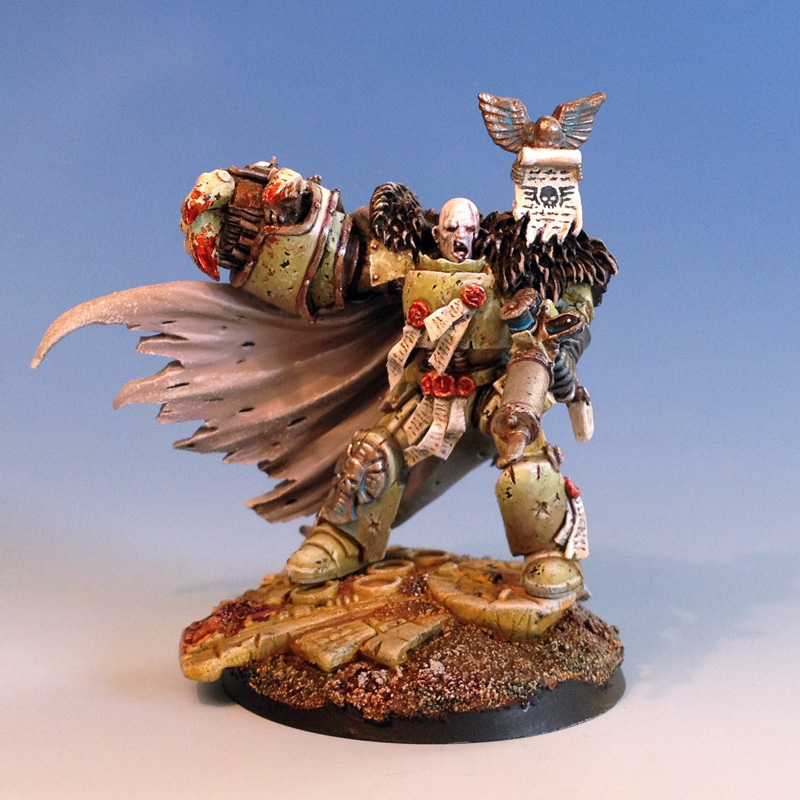
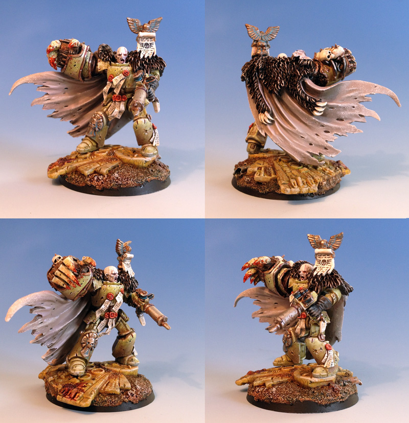
Will be used as an inquisitor Lord who has gone Heretic...
I have had a few questions regarding the process so here are a few notes on the main parts:
CAPE was painted using Coat d'Arms 222, Horse Tone Roan, a nice beige with a dap of old purple ink. Sprayed on with an airbrush, gave it two highlights adding more and more white. A little shading mixing a little more purple and some chaos black into the base colour, and then final highlights dapped on with a sponge and using almost pure white.
On the ARMOUR I washed on a yellowish green, then picked out some shading and damage. Then highlights, then some brown glases of rust like colours, blacks, and oranges. And then final highlights of almost pure white. A fun trick was to use a broken but light green for the basecolours and then for highlights I based it on Reaper Master Series Moth Green with white added. Very much like the old billious green from GW. Classic. It is all about going back and forth until you find that it is there...
I'm not shaking his hand.
ReplyDeleteLooks bloody and lovely. Well done sir.
Very nice! I love there character you've given him. I can see lots of expensive parts went into this guy.
ReplyDeleteThe painting on his cloak is very good, what colors did you use there?
How did you achieve that spotty, John Blnache-esque effect on his armor?
Cheers.
ReplyDeleteCape was painted using Coat d'Arms 222, Horse Tone Roan, a nice beige with a dap of old purple ink. Sprayed on with an airbrush, gave it two highlights adding more and more white. A little shading mixing a little more purple and some chaos black into the base colour, and then final highlights dapped on with a sponge and using almost pure white.
On the armour I washed on a yellowish green, then picked out some shading and damage. Then highlights, then some brown glases of rust like colours, blacks, and oranges. And then final highlights of almost pure white. A fun trick was to use a broken but light green for the basecolours and then for highlights I based it on Reaper Master Series Moth Green with white added. Very much like the old billious green from GW. Classic. It is all about going back and forth until you find that it is there...
Lovely stuff.
ReplyDeleteI didn't hink the giant fist would work but I actually really like it now I see it all together and painted.
Awesome and thanks for the outline of your process.
Nice job - as always.
ReplyDeleteIs that freaky little churubivm based on an old snotling?
@ Vader: The cherub is from a classic late 80s Empire banner pole. I just had to snip it off the pole and pin it into place.
ReplyDeleteReally really cooool! /Hans
ReplyDeleteFrighteningly good for such a short turn around.
ReplyDeleteI'm really digging the OTT power fist and the little Cherub.
PDH
Really cool! Like the way the huge power fist pulls the attention. The movement of the cloak intensifies the effect even more.
ReplyDeleteAwesome work!
ReplyDeleteYeah, that's my kind of mini. He looks so cool. Great expression on the face. That fist is huge. Would you mind if I share some of your work on my blog if I accredit and post a link back here?
ReplyDeleteHi and thanks. Sharing is alright with credits and linky back. Thanks for asking. btw, had a look at the site. Nice stuff.
DeleteThank you :)
ReplyDelete