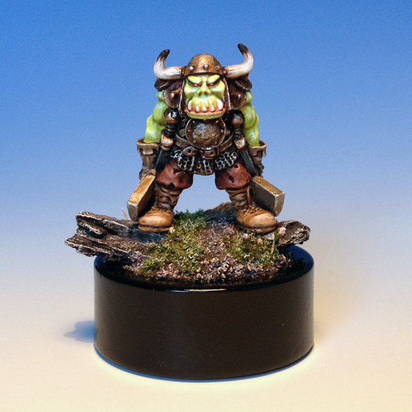
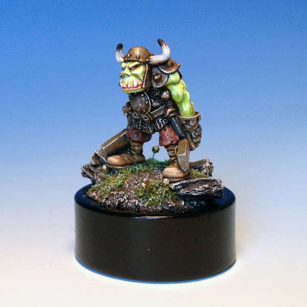
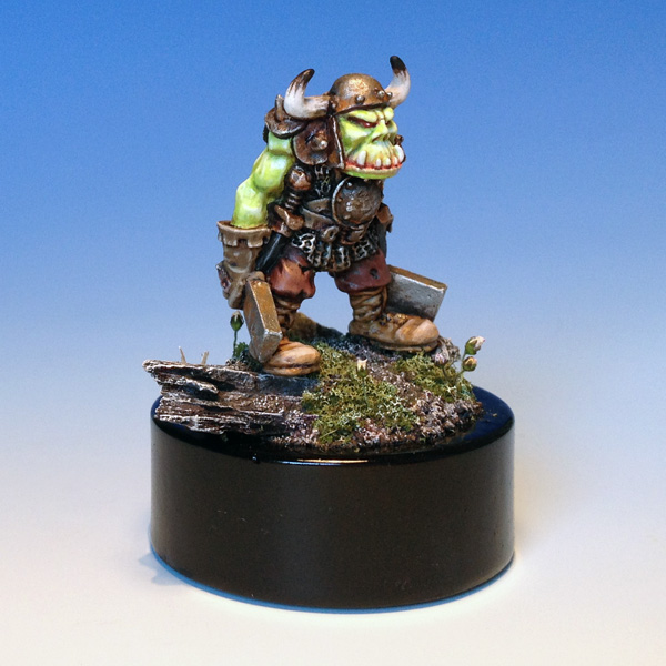
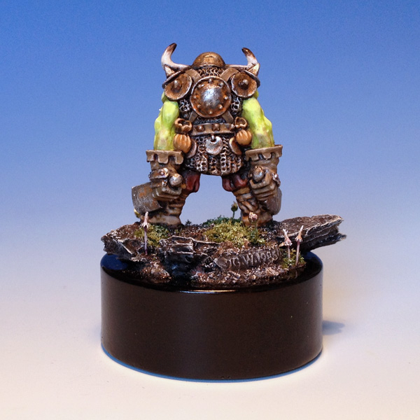
I finished the orc the other night:
As mentioned, I first saw this model in the Citadel Miniatures Painting Guide back in 1992 or so. There was a colour sketch of the model in the guide. This is - in itself - interesting. A model shown with a drawing - how intriguing is that? And the drawing came with suggestions for colours, so you might imagine how I wondered something like this: "...if I could get hold of this cool orc, would I be able to make it look like this?...How would it turn out..." Well, now I have had my try anyway.
The model is from 1985, real vintage, so I added the miniature's tag to the back of the scenic base. Paintingwise, I wanted to go back and use the suggested colour scheme from back then taking the green in a very light and vivid direction.
I really enjoyed painting this model. The process was nice and quick and the model is now in my cabinet.


An iconic model given a first-rate pj. The tag at the rear is a really nice touch.
ReplyDeleteThat's awesome. I love the incorporation of the tag on the base.
ReplyDeleteVery interesting model choice. What struck me immediately is the very soft contrast between the teeth and the face, was there a particular intention behind this?
ReplyDeleteExcellent work as usual, I particularly like the way the skin stands out from the rest of the figure. I have the opinion that with these vintage figures (which I like a lot), it is more important to choose a striking color scheme than to adopt fancy techniques such as extensive blending. They are also more suited to a "non naturalistic" style (such as "red wood" for instance) than today's models. I'm curious of what do you think about that.
ReplyDeleteCheers.
ReplyDeleteThe tag was an idea I took after seeing Benoît Menárd do this to a cool 1985s model. A great idea.
The light tones used around the teeth, mouth and face-area was chosen exactly to have that big bold contrast between the flesh/face areas and the clothes and armour.
The comment about vintage models and colours and style is an interesting one. Initially I would agree, but at the same time I am sure that the models could work just as well with a hyperrealistic colour scheme.
I find that the main thing about vintage models (on foot) is that they are usually moulded in one piece which makes them quick to paint - simply because of the limited details. You basically have two sides; front and back. So these models are by ways of production very graphic and 2D. And that actually make them great models to paint and present on the web.
Personally, that's the one thing I never really liked about the classic model range - that they are so planar and 2D. This also didn't make for a large variance of poses.
DeleteAbout the colour thing, I agree. I really like to see vintage models painted in contemporary schemes, like you have done here. Nothing beats a classic with a new spin...
I recently read someone commenting that GW's "red period" might have been due to games being played strictly on green tables and all minis having green bases as a consequence. So red was the natural contrast. I'm not sure how accurate this is, but I like the observation. I think a lot of the redness was influenced by John Blanche's art, though.
Yeah Jimmy you are of course right about the 2D-ness of the old models. The dynamic potential for a one-piece casting in a simple sandwich mould is of course limited, BUT on the other hand the limitations make for design that is easier to actually get to with the brush and thus quicker to paint. Again, this is why I like painting these models from time to time.
ReplyDeleteOf course - nothing beats the quality in today's plastic casts. Both in regards to details, composition and dynamics. As I have mentioned before I love GW's single character plastic sprues. They are just awsome, easy to assemble and great to paint. But it does take longer because of the more complex design.
About the "red period" I also think that a remark on the appeal of colours in general is relevant. Red is just - by default - a strong colour that works and that people likes. And it is used everywhere, so why not on toy soldiers... I paint them red all the time anyway!
He looks so...... Back then:-)
ReplyDeleteReally cool.
That really looks excellent. Would you mind sharing a few words about how you did paint the skin; I would be most grateful.
ReplyDeleteExcellent work!
The bright green was done using a basecolour of Reaper Master Series Moth Green with a bit of white painted over a white under coat. I then blended some Citadel Dwarf flesh into the mix around the elbows. Next was shading which if I remember right was done mixing very, very little chaos black into the basecolour and blending this into the shades. Then I did hightlights adding white to the basecolour. A few takes taking the highlights up to almost pure white. Then some thinned GW purple and red wash around the mouth and eyes and here and there on the skin. And finally a touch-up for the almost pure white highlights. Then the skin was gloss varnished using W&N and left to dry overnight. And next day a final coat of matt varnish over the gloss. Overall, the process had a structure, but I did go back and forth between shading and highlights to make sure I achieved what I was after.
DeleteThanks very much. I am painting some 80s orks myself at the moment, and trying to get a similar sort of look to the skin. Very helpful.
DeleteThank you.
Very cool piece - again... ;)
ReplyDeleteAlso I allowed myself to nominate your site for Liebster award:
http://demimorgana.blogspot.com/2014/05/liebster-award.html
Cheers.
DeleteAnd thanks for the nomination. Now I need to find out what I am nominated for and look into this Liebster-thing... :-)
It's kinda positive feedback spam thing ;)
DeleteBut it's nice and charmful - no worries!